Brand identity & strategy for Axemed
We built Axemed’s brand strategy and identity - clinical, modern, and trustworthy - and are rolling into web and social to drive B2B demand across KSA and EU.

Clinical precision, commercial clarity
Axemed distributes medical and dental products; the brand needed to signal reliability without feeling consumer. We anchored strategy on three pillars - Precision · Availability · Support - and translated them into a minimal, technical identity.
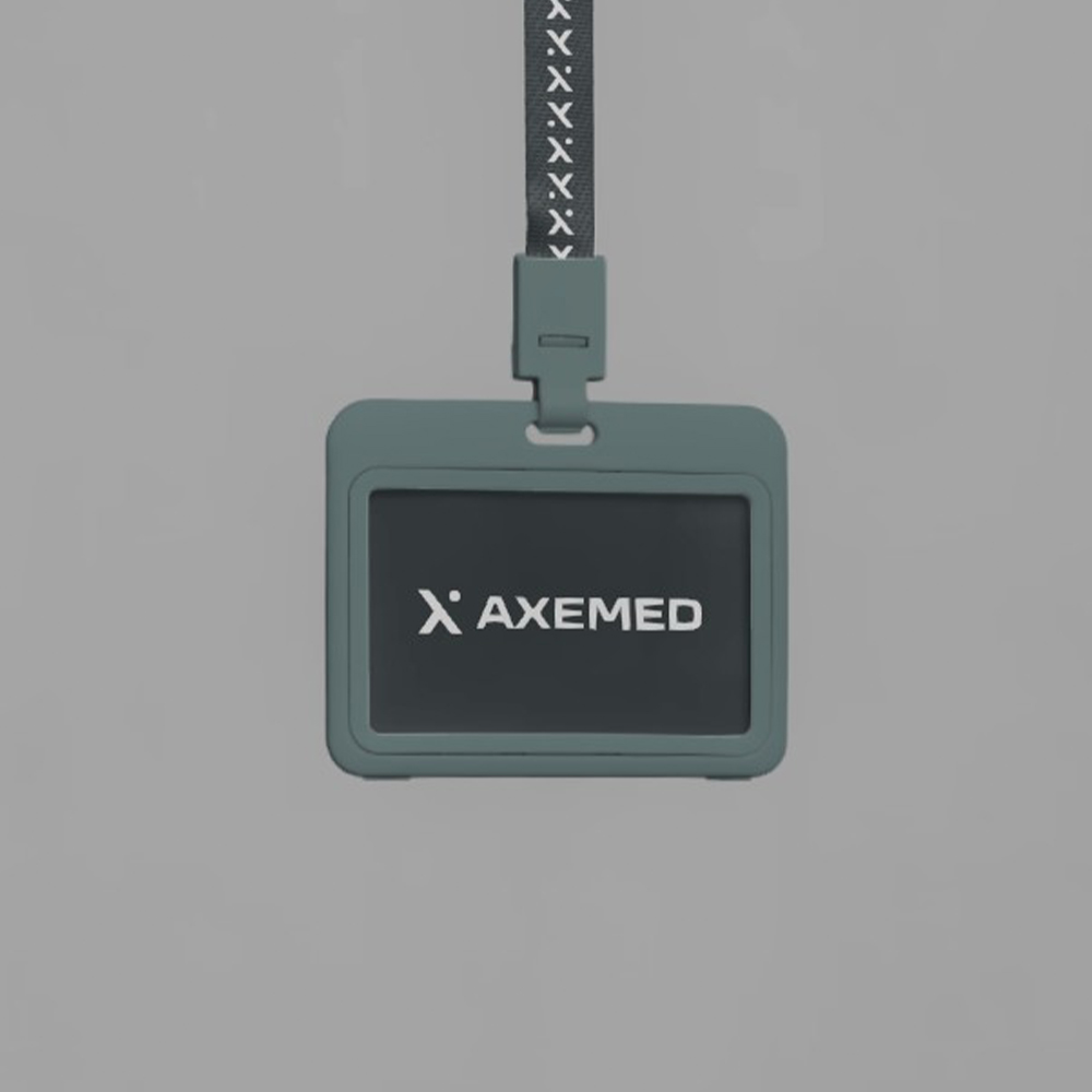
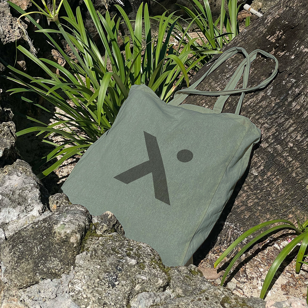
- Logo: an abstract “X” with a dot forming a subtle human figure - movement and care within a geometric, engineering feel. A wide, clean “AXEMED” wordmark communicates stability and B2B confidence.
- Palette: Deep Charcoal Blue and Midnight Graphite provide serious structure; Pure White keeps it clinical; Axemed Teal Grey (#7C9393) carries the brand; Near-Black Blue supports high-contrast UI and typography.
- System: button, icon, and layout rules designed for dashboards, datasheets, and catalogs; a calm, factual voice that travels across Arabic/English channels.
Next, we’re extending the system to a fast, conversion-ready website and always-on social that showcases products, education, and partner stories.

More Momentum
Related projects you might like
Three fast case snaps - different industries, goals, and formats. Skim what we shipped and see how the playbook adapts.
Let’s build yours
quick scope & clear cost
Tell us your goal and timing. We’ll share a tailored scope, budget range, and first-week plan.


